A brief look into the 2020-2021 Premier League Season
Author's note: data used for this post (and much more) can be found at fbref.com.
The 2020-2021 Premier League season came to an end last week, with Manchester City re-claiming their title despite their tumultuous start to the campaign. Many teams stumbled, losing their European spots and falling short of their pre-season expectations. Sheffield United suffered one of the worst Premier League campaigns in modern history, collecting only 23 points. West Ham United broke into the top 6, leaping ofer the anemic Tottenham Hotspur and aimless Arsenal. How do the underlying numbers look for the 20 clubs?
Firstly, a cursory glance at expected goals (xG) and expected goals conceded (xGA) seem like the most logical place to start.
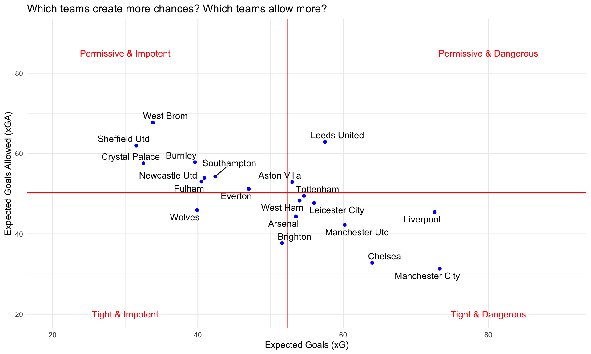
It is not surprising to see the top 4 teams in the standings placed in the bottom-right quadrant at high xG and low xGA. Manchester City led the league in xG while the recently relegated West Brom led in xGA. Leeds United meanwhile lived up to their frantic playing style, placed under the permissive & dangerous category. Everton cemented their late-season collapse despite a promising start, and their xG metrics reflect this result.
Did any teams beat their respective expected metrics? Below show a plot of expected-to-actual differentials.
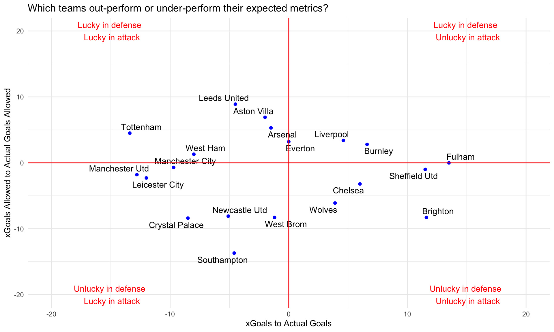
Brighton under up-and-coming manager Graham Potter indeed played rather 'attractive' football in a sense they opted for attacking football. Their impotency up front as well as the lack of depth in their attackers summed up their performance in the expected-to-actual goal metrics. Teams such as Manchester City, Leceister, Manchester United, and Tottenham beat the expected goals metric, out-performing the expected - a testament to their talent up front perhaps, and a bit of luck in the final third. Southhampton led the league in the expected-to-actual goals allowed ratio, meaning they managed to concede the most goals relative to expectancy - their downfall in the second half of the seaosn surely relates to this.
Teams in the bottom half of the standings often get labeled as 'park the bus and pray' teams. Is this true? Below graph shows ball touches in their own penalty box vs. the opposition's.
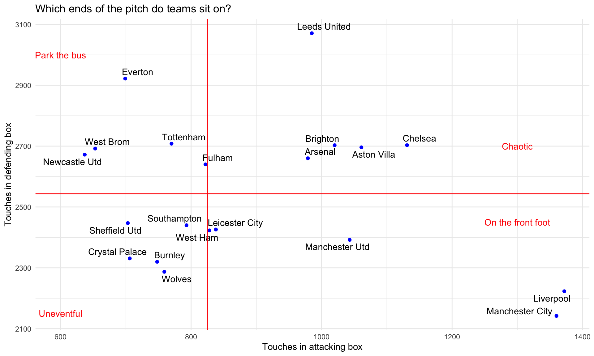
'Chaotic' is definitely one of the words to describe Leeds this season. Brighton also fall into this category, as well as Arsenal, Chelsea, and Villa. Could this reflect their willingness to attack despite their deficiencies at the back? Man City and Liverpool lead the way in touches in their opponent's box while seemingly spending little time in their own. Newcastle and West Brom - do they park the bus? They are definitely not the company you'd hope to be neighbored with, if you're Tottenham Hotspur. Meanwhile, Burnley somehow managed to have less touches in their own box relative to the league median. Perhaps old stereotypes are just not true.
The best way to win games reliably is of course to score more goals than your opponents. Next visual shows SCA90 - shot creating actions per 90 minutes. For these bar graphs, the red horizontal line denotes the league median in each metric.
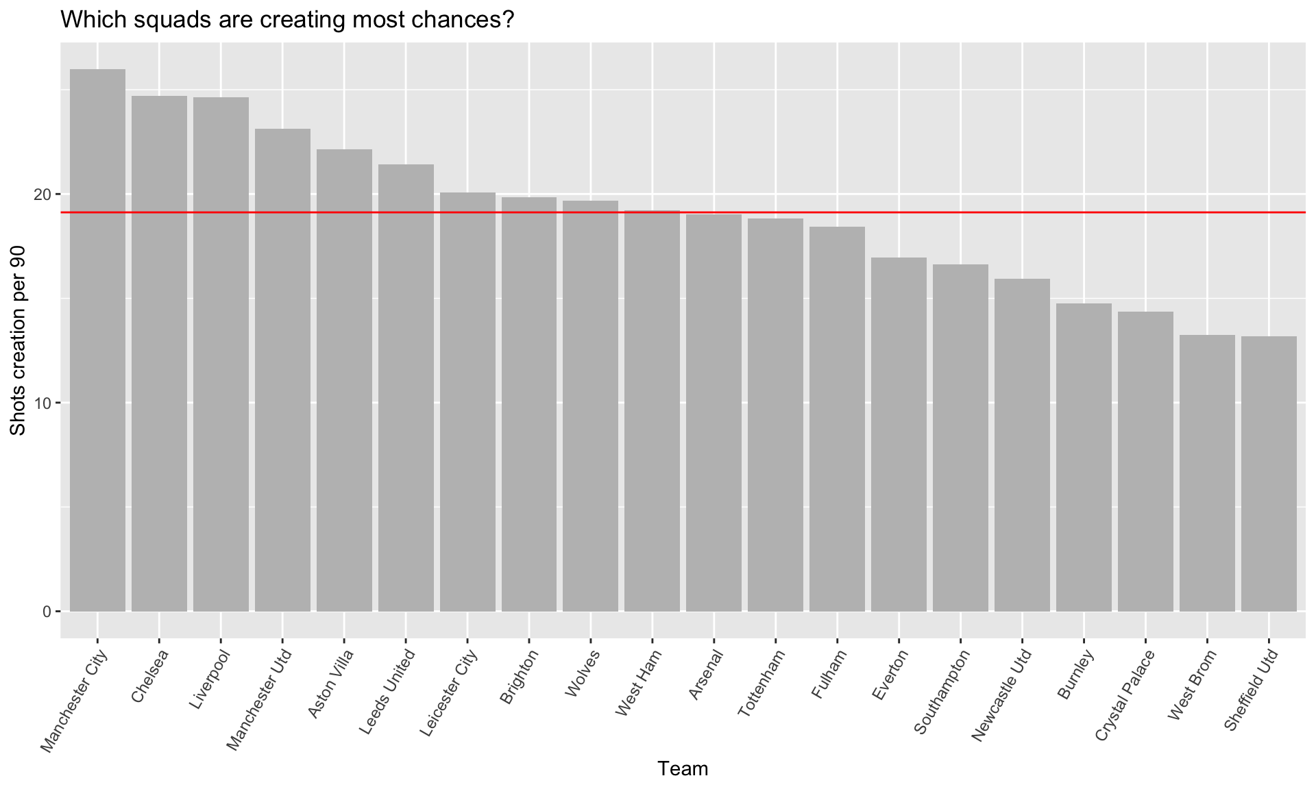
Again, we see the top 4 teams in the standings at the top 4 spots in this metric. It's interesting to see that the two remaining members of the traditonal 'top 6' - Arsenal and Tottenham - rank lower than those such as Villa, Wolves, Brighton, and Leeds. Crystal Palace did not have much creativity in the shot creation department, and perhaps the supporters should be relieved their team has avoided the drop.
Where do these shot creations originate? Below shows the ratio of dead ball to live ball actions leading to shot creation.
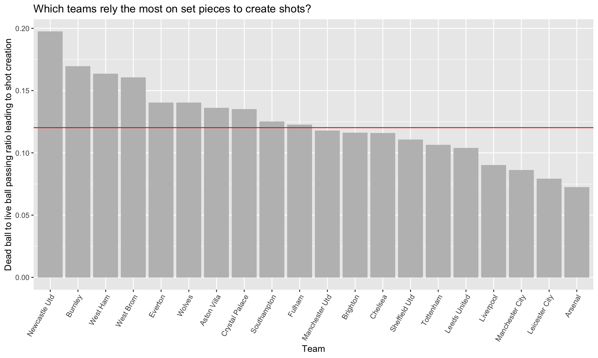
Unsurprisingly - if you've watched them play this season - Newcastle United lead the way in this category, relying the most on set-pieces to create chances. Burnly, West Ham, and West Brom follow them in relying on dead ball situations. The Hammers did well this year in finishing in a European spot, and this shows their dead ball plays must have been somewhat reliable.
This is somewhat similar to one of the plots shown previously, except this uses ball touches in the final third (not necessarily the box) relative to touches in the defending third.
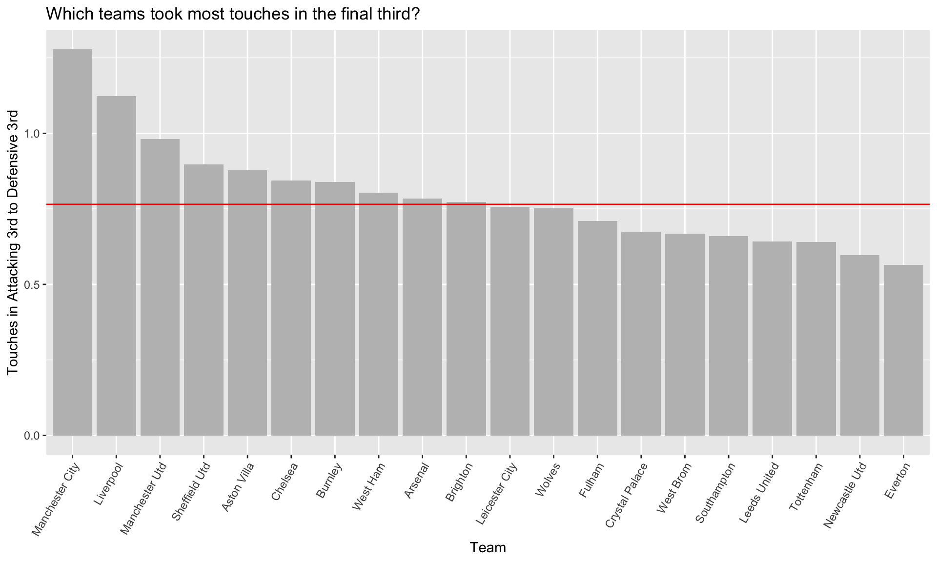
Again, Man City lead the way with Liverpool and Man U not far behind. Surprisingly, it turns out Sheffield United took the fourth most touches in the final third relative to their own third - how is this possible if they finished 20th in the league? A lot of things must've went wrong this year for the Blades.
Teams may rely on progressive carries into the final third to create chances. Below shows the ratio between progressive carries to total carries. Again, red line indicates league median.
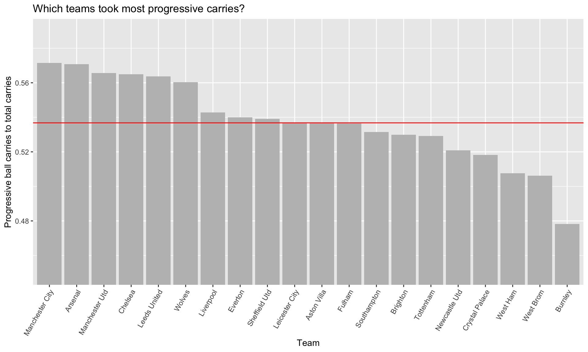
It turns out Man City practically lead the category in most of these metrics. Arsenal is not far behind (at all), despite finishing 8th this year in the standings.
The last 3 metrics which were all ratios - touches in the final third, progressive carries, and set piece passing ratio - may or may not be good predictors for expected goals. For the last part, I used these three metrics for simple linear regression (OLS) using xG as the response variable. This was the result:
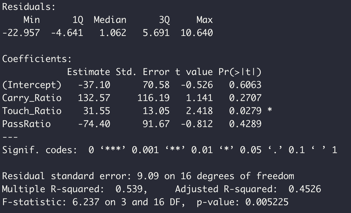
This suggests the touch ratio - ratio of touches in the final third - could be linearly related to xG. Can we visualize this?
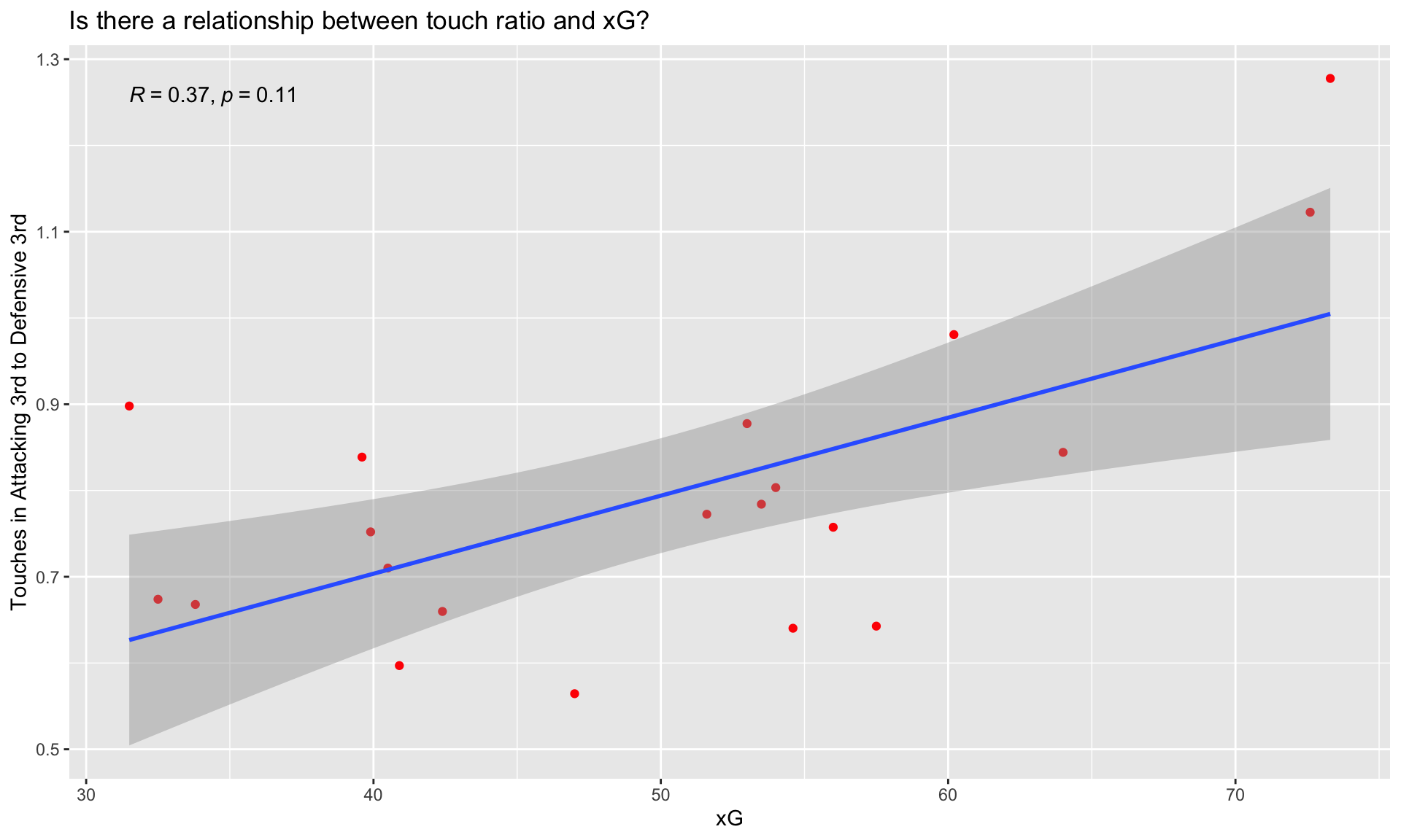
Indeede, we achieve a moderately positive Pearson correlation of 0.37. So it turns out action in the final third leads to xG. It's not exactly rocket science, but here we have proof.
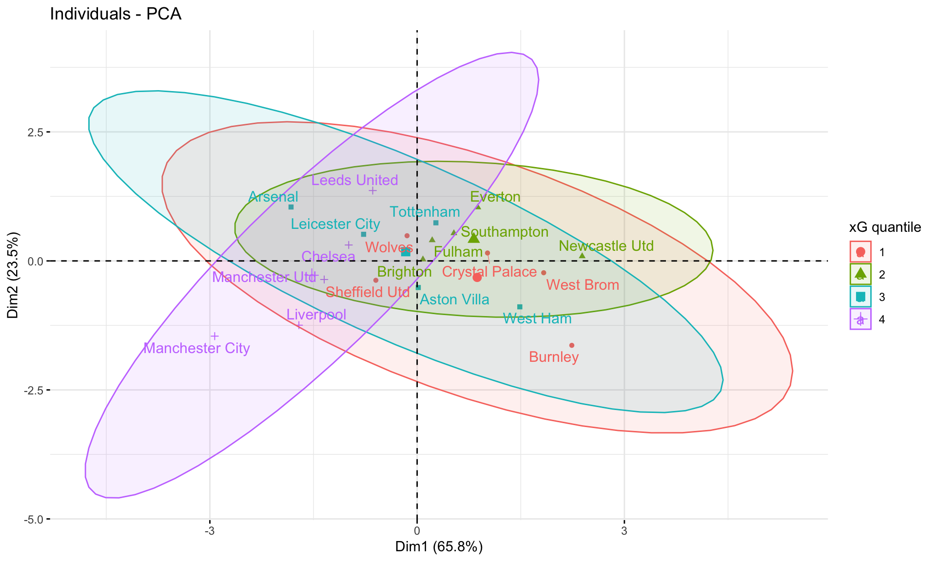
Finally, as a bit of a food of thought, here is a PCA on the three ratios and every team. The color labels indicate 25% quantiles in xG standings. Some local clustering, and maybe we can squeeze out a bit of meaning.
